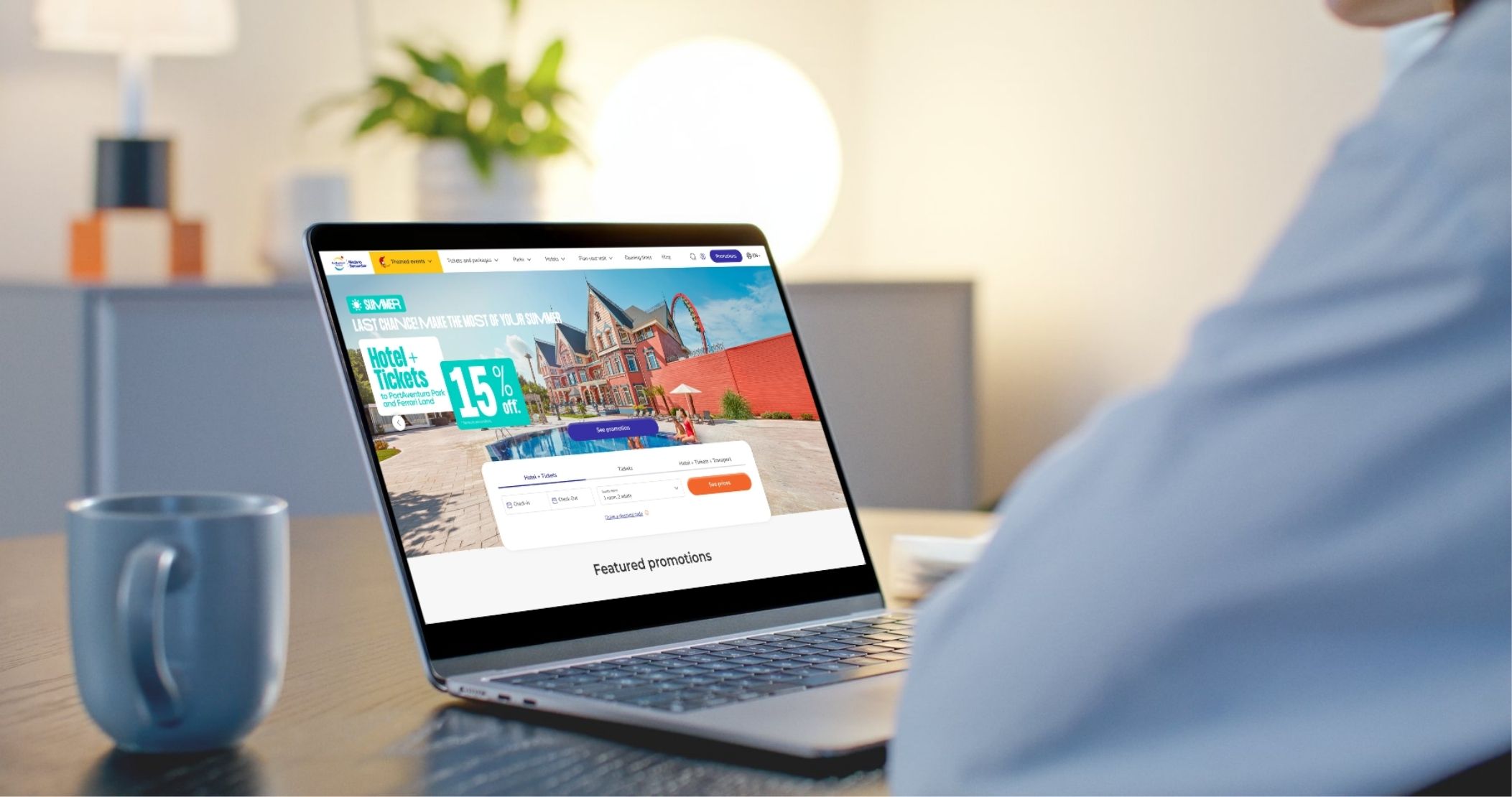
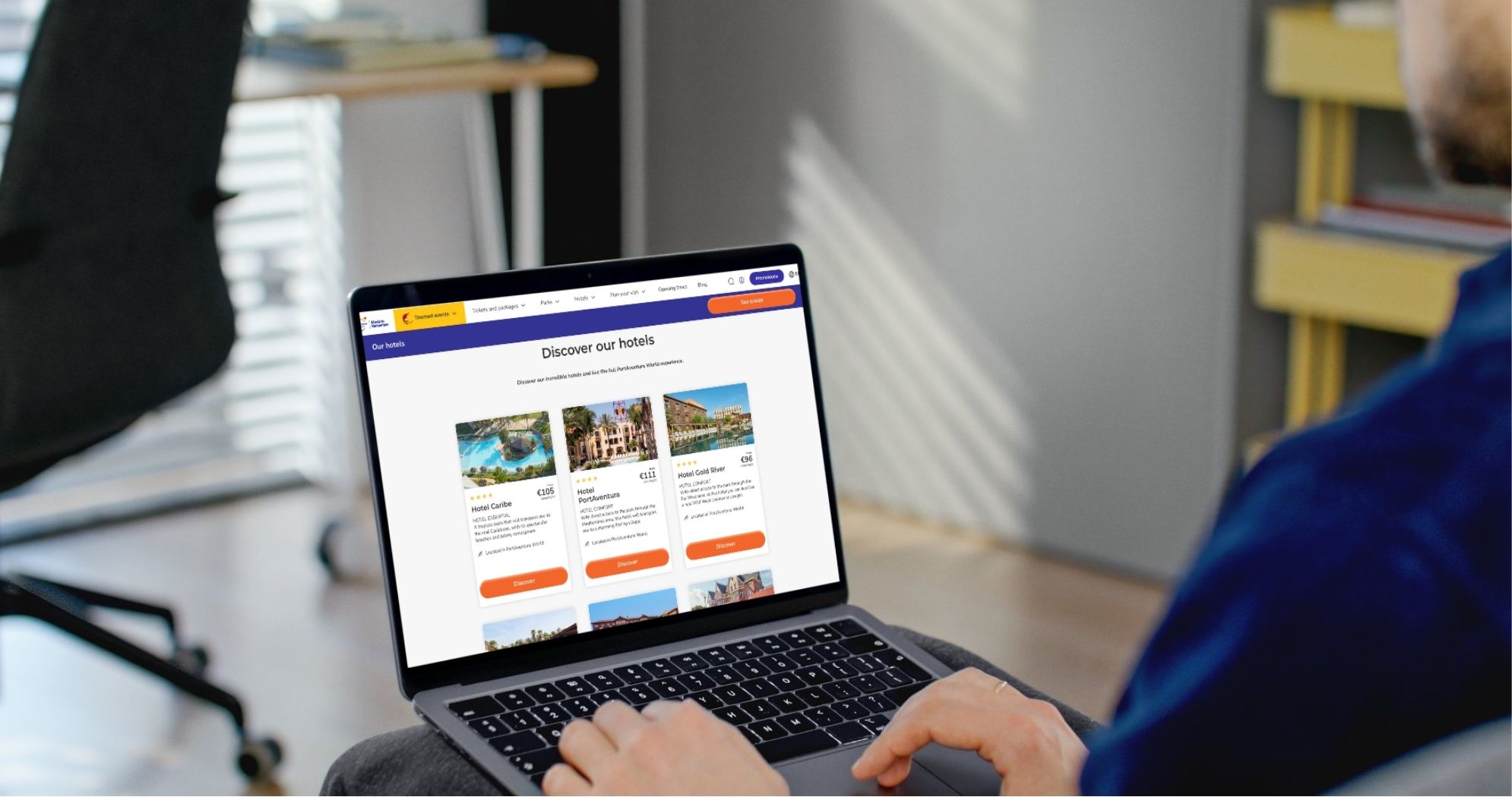
PortAventura World is the largest theme park in Southern Europe: 3 parks, 10 hotels and 5.5 million visitors a year. One objective: make the digital experience as good as the park itself.
Three platforms, multiple vendors, zero shared language between them. No design team, no design system. The brief was deceptively simple: improve the digital guest experience. In practice, it meant building everything from scratch without ever pausing the platforms already in production.
The hardest part wasn't the screens. It was building the conditions for good design to happen consistently. Nobody owned the experience end-to-end, and it showed in every touchpoint.
Different teams: app, web and in-park comms managed independently, with little to no alignement between them
No shared design language: app, web and self-vending machines each built independently
Fragmented flows: no pattern standards, low conversion, some products missing depending on the channel...
Multiple vendors: no shared infrastructure, inconsistent results, changes that took weeks
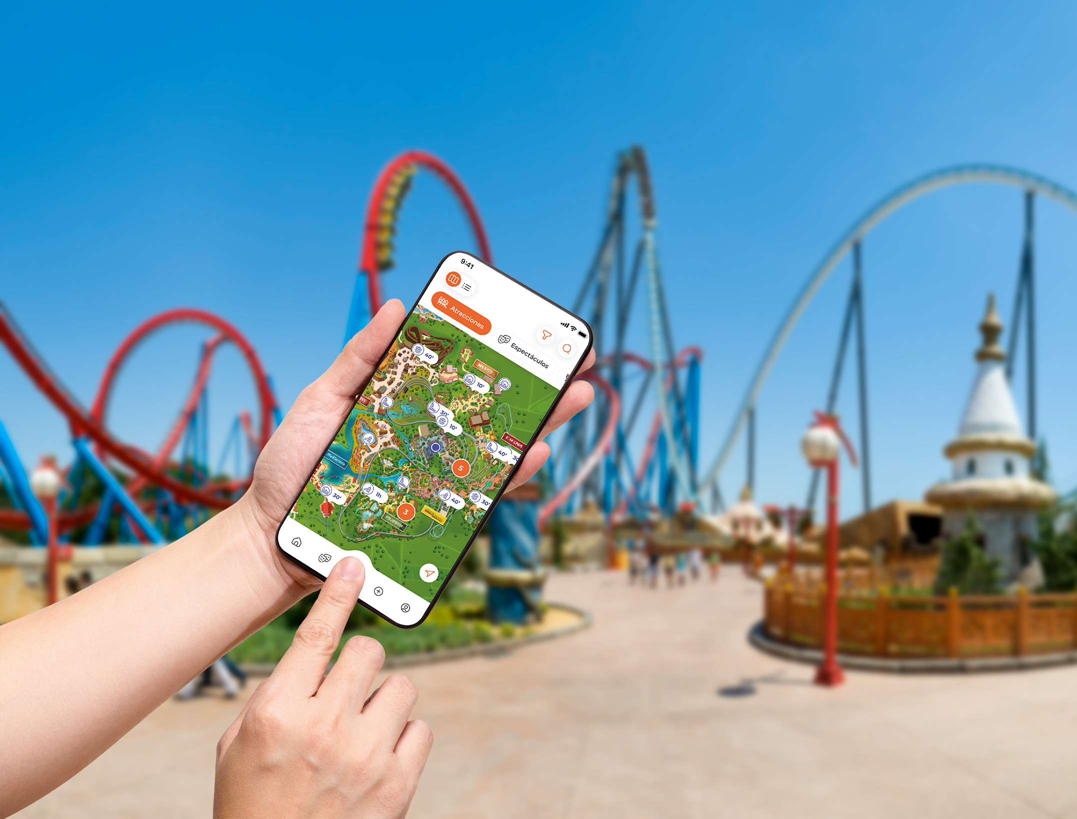
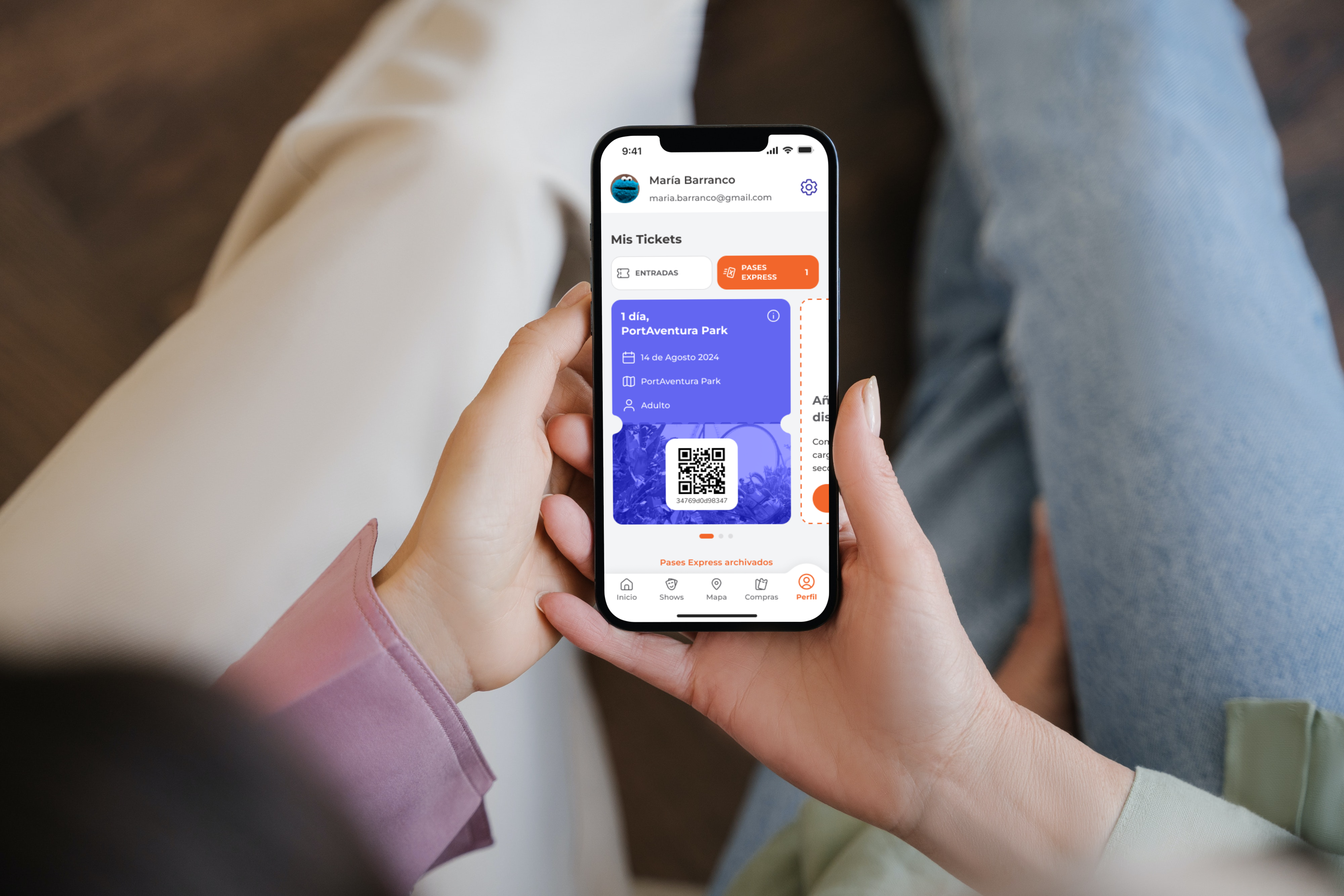
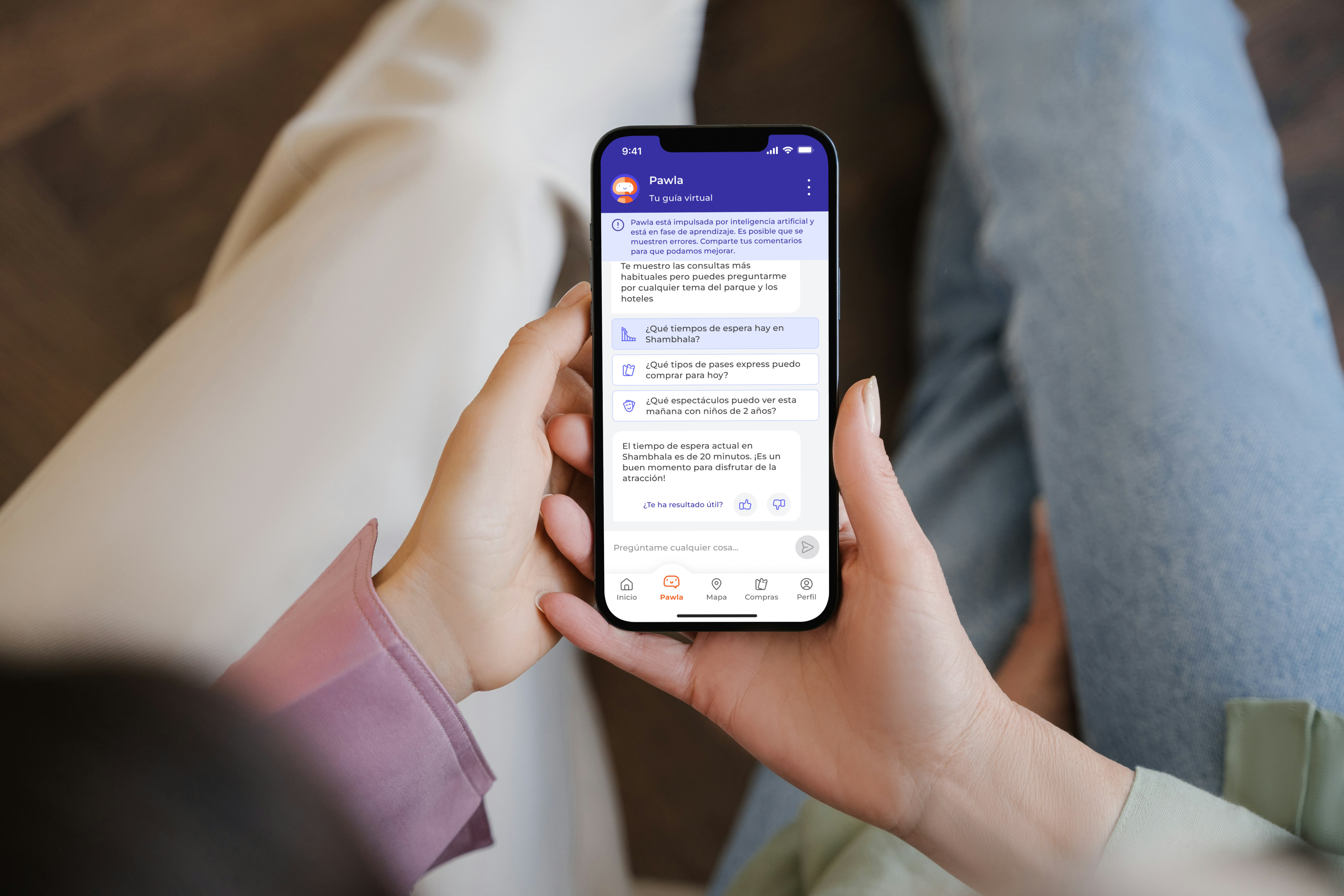
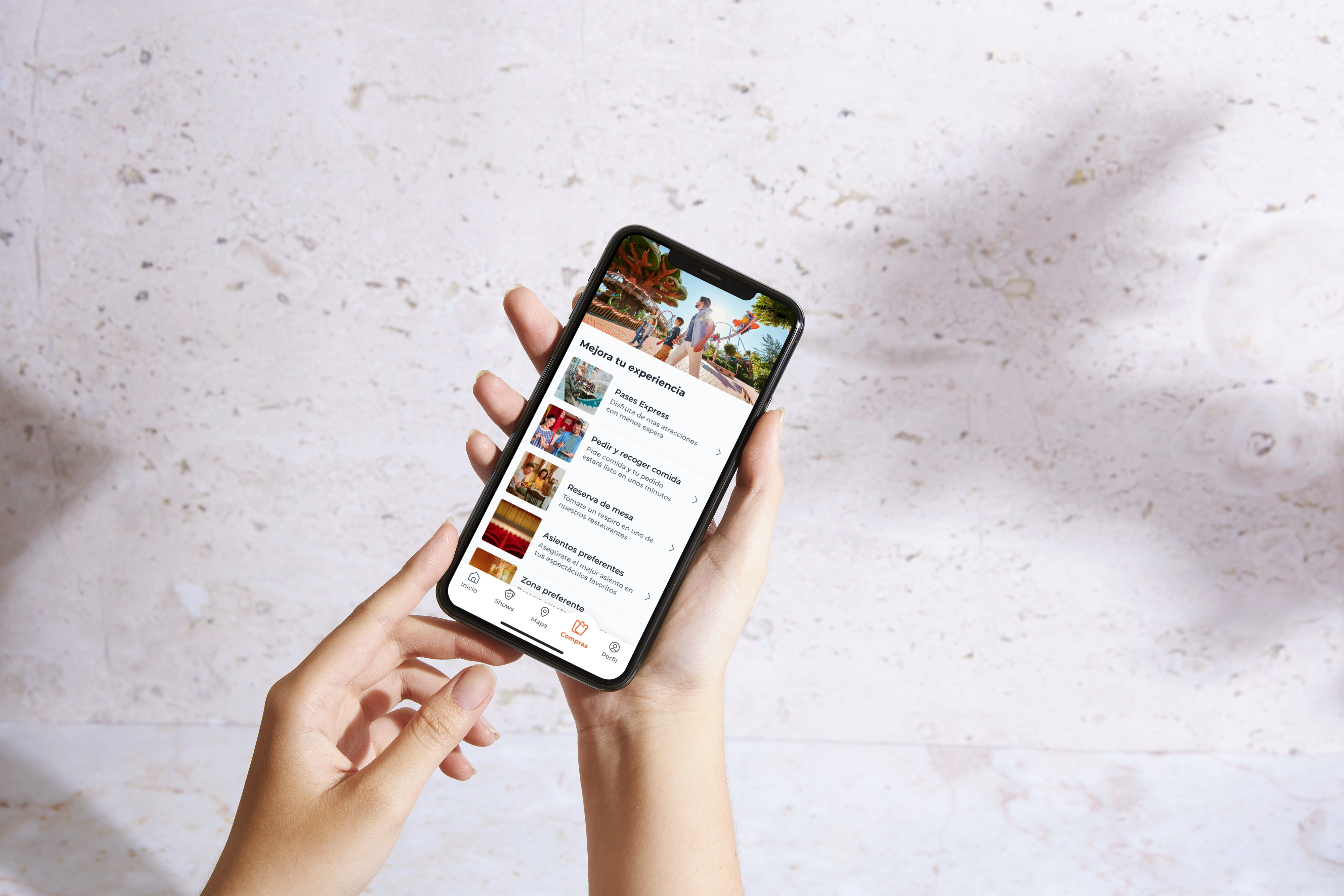
PortAventura World App, launched June 2023
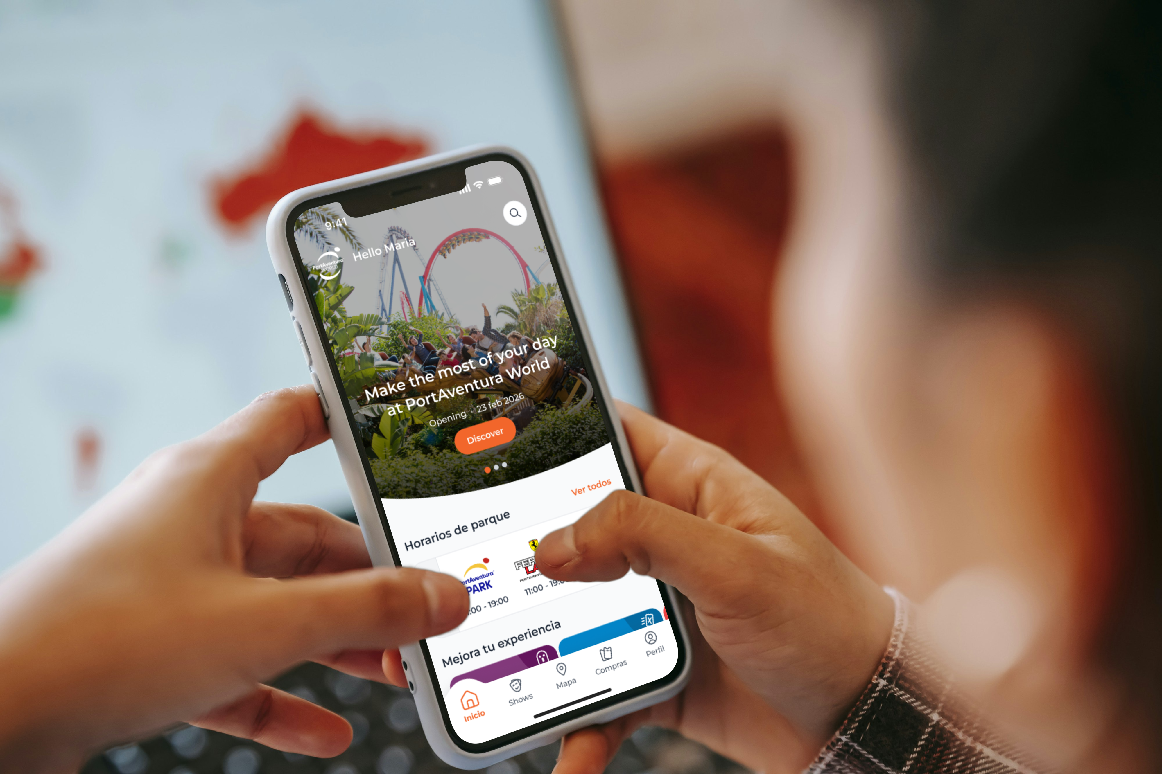
We couldn't pause for a full redesign, so we evolved it incrementally: fixing the app first, prioritising revenue next, and unifying everything once the foundation was solid enough to build on.
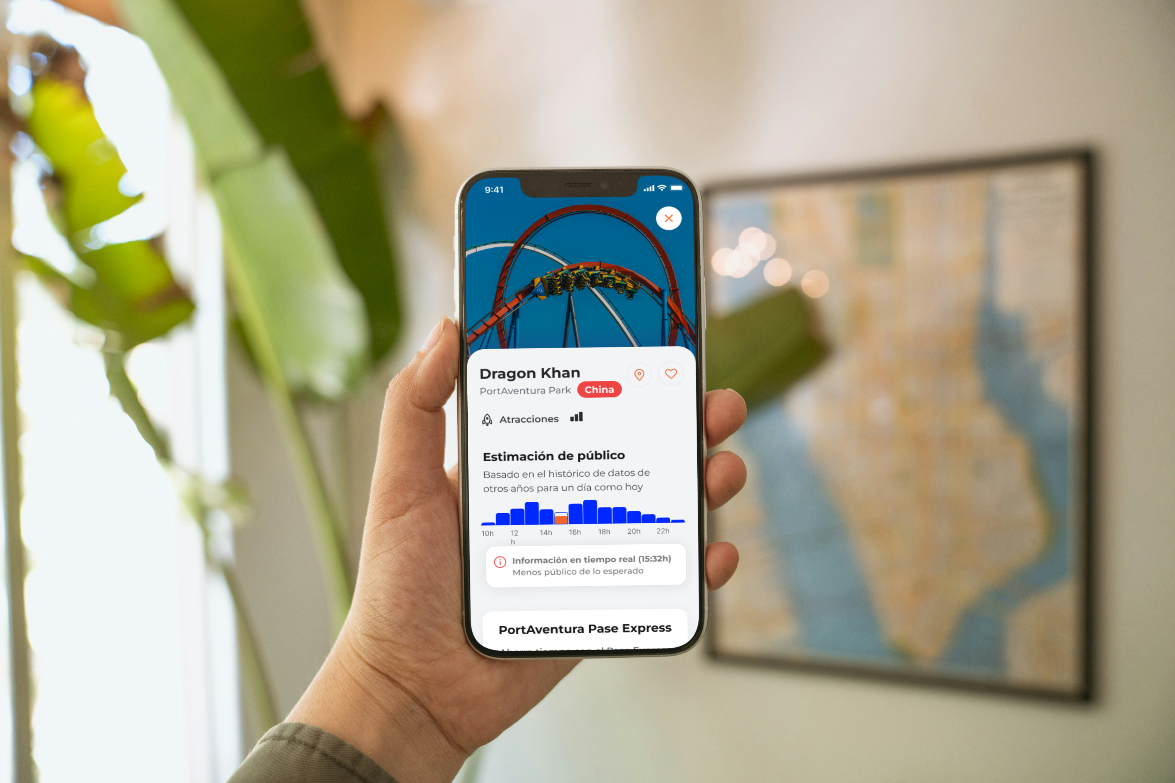
New navigation, offline-first map, context-aware UI designed for real park conditions. All the Design team carried out in-park research in order to validate every decision with real users and real conditions: 35°C heat, with guests who had one hand holding a kid and about 15 seconds of attention, sun, shadows...
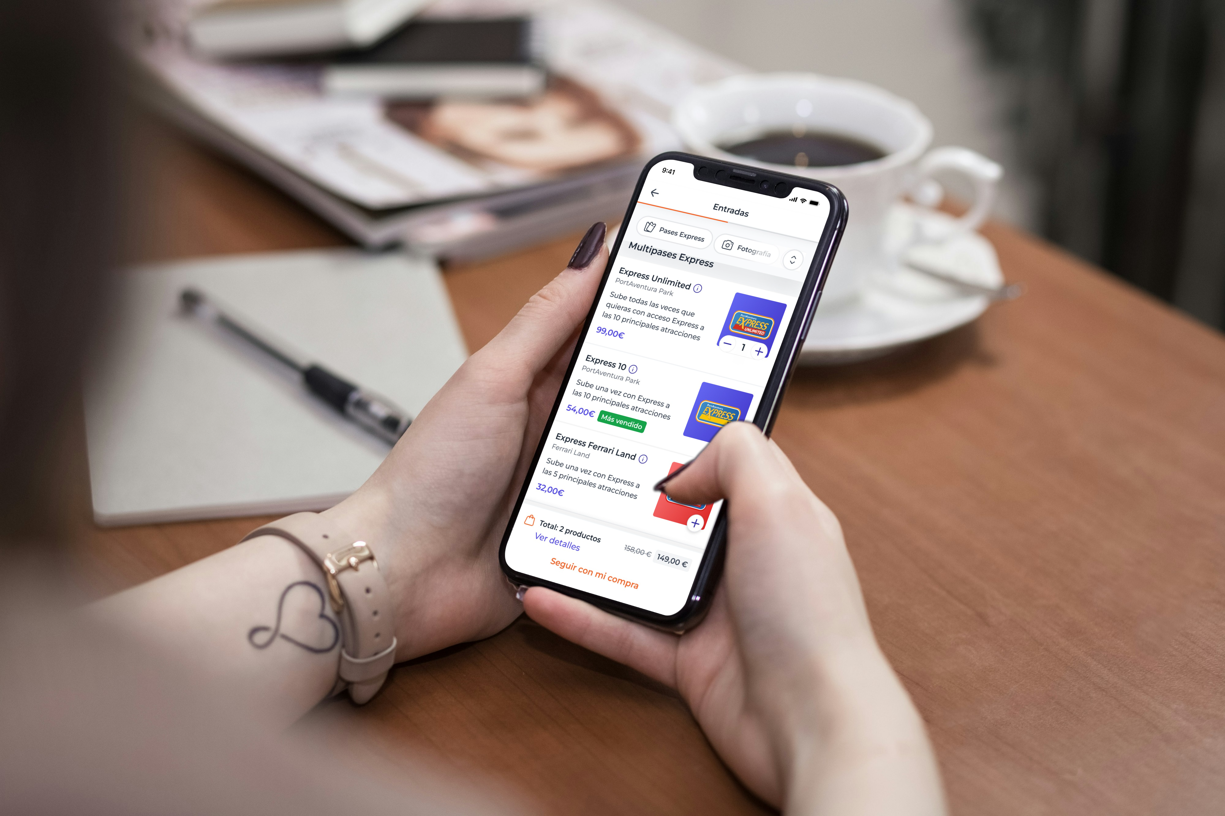
Full catalogue audit: dozens of ticket types, bundles, seasonal products, hotel packages, all with different logic and no shared patterns. We standardized everything into one purchase system, A/B tested the critical flows, and conversion tripled.
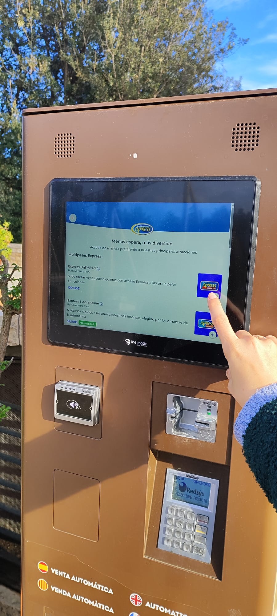
App, web and self-vending machines on a single CMS and shared Design System. Changes that used to take weeks now ship overnight. Dynamic pricing per channel. The infrastructure finally matches the ambition.
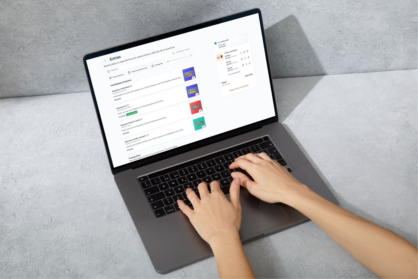
The product catalogue at PortAventura is genuinely complex, and the original flows tried to surface all of it at once. We ran a full analysis, found the patterns that kept breaking across different product types, and replaced them with one system that handled the complexity without exposing it to the guest.
Redesigned purchase flow, one system across all product types
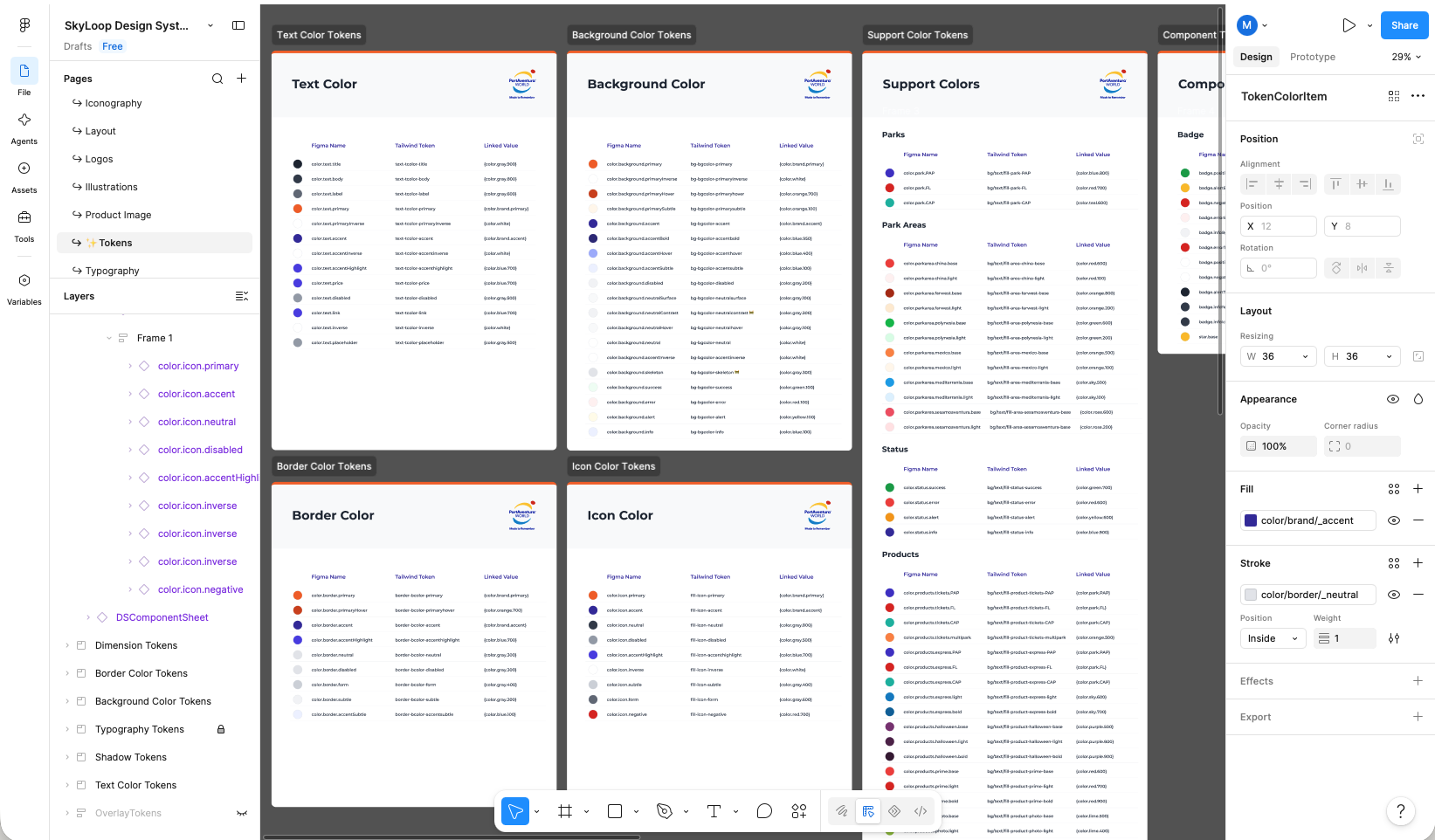
Small team of designers, three platforms, 1 year. Without a shared foundation every decision gets contested and every component gets rebuilt from scratch. The token-based Design System (usign Token Studio) wasn't a nice-to-have, it was the baseline for shipping anything consistently at this scale.
It was built in parallel during the app releases, not before it. That matters: it was tested against real data from day one, and adoption was organic. Designers used it because it was faster than not using it.
Token-based Design System, one source, three platforms
Research in context, not in a lab. Doing sessions inside the park changed everything we thought we knew. You cannot simulate 35°C heat, a closing queue and a phone with 4% battery. That environment is the product brief.
Standardize before you scale. Auditing every purchase pattern before extending to web and self-vending machines was slow and sometimes frustrating. It also meant we didn't multiply broken patterns across three surfaces when the ecosystem launched.
Phygital experiences are evolutionary by nature. They let you create new experiences quickly, test and learn continuously, and personalize for different moments, users and contexts. All of this faster and at a lower cost than building separately. That's only possible when the digital and physical are genuinely connected.
You only get one chance to impress. There's no monthly retention, no second visit to fix a first impression. Expectations are sky-high and frustrations are equally strong. Screens exist to solve a moment, not build a relationship. When something breaks, it's not a failed interface. It's a failed moment.
The physical experience will always outcompete the digital. Our real competition for the user's attention is Shambhala. It's their kids screaming. It's being hungry and hot. The user doesn't see systems: they live a single experience. The digital layer is only good if the operational layer is good. One can't carry the other.